Group: Promoting ipernity
8.1 Landing page 'Explore' - Relaunch 2020
|
|
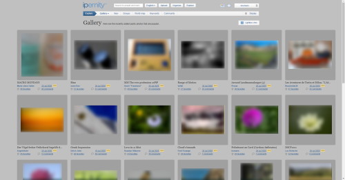
Here we can discuss ideas on how we can optimize the landing page Explore and bring the new internal link Explore / Community to life in terms of content and design so that it is attractive and informative for vistitors from outside.

Here in the main article we will record agreed measures and name the volunteers who will take care of their realization.

Here in the main article we will record agreed measures and name the volunteers who will take care of their realization.
The topic of this discussion has been edited by Public Relations 10 months ago.
This discussion has been closed by Public Relations.
Jump to top
RSS feed- Latest comments - Subscribe to the comment feed for this topic
- ipernity © 2007-2024
- Help & Contact
|
Club news
|
About ipernity
|
History |
ipernity Club & Prices |
Guide of good conduct
Donate | Group guidelines | Privacy policy | Terms of use | Statutes | In memoria -
Facebook
Twitter

www.ipernity.com/club
To make images possible to download has to be done from the:
"Authorizations, license ---> Change"
It is on right side of each image. Turn image either to CC or free.
OR, turn selected people as your "Family" members, and change settings here:
www.ipernity.com/pref/original
Bergfex club2) New ✅ For my sake it can also be activated for guests. By the way, we have not yet published the update in the newsflash. I have noted it down.
3a) Groups / design ✅ For the time beeing I woul keep the design. It is reasonably attractive and runs faultlessly. We should keep it that way for the time being. Because we have more urgent building sites.
3b) Groups / content ❗ This should be adjusted so that only living groups are displayed. (For a transitional period I could imagine as a quick solution that we select a corresponding database extract manually at short notice and store the selection. Only Rob can say what is best feasible.)
4) World Map ❗ Very large amounts of data seem to be gathered and transferred. I stop for 12 seconds until the red dots appear. My pictures from my residence are not shown at all, although they all have GPS coordinates. I consider this feature dispensable. I would agree to disable it temporarily until we have a better solution one day.
5) Keywords An ancient and confusing design. I would prefer to see real rankings. But in my opinion it is without any priority. Does anybody even use something like that?
6) Community ❗❗❗❗ This is an absolute priority! Because the information about it is scattered in many places. See: www.ipernity.com/group/2603430/discuss/195332/comment/61631000#comment61631000 It is very bad to expect the users to search for it themselves. For a start it would be enough to realize a quick solution: Let's create a subpage where this content is listed and further linked.
Public Relations clubSee also his earlier contribution to this discussion above.
This proposal is equally supported by the ima team.
We ask for your comments on both existing drafts.
Further drafts are welcome.
raingirl clubIt's a bit hard from this image to get into any detailed considerations (like what is said next to the headings), but in terms of the layout it seems clean and easy to quickly understand what's going on here, and that would get the point across.
To me, this last one is better in terms of quick glances - getting the info across. I like the readability of the headings.
I still like the layout of the prior one better, but that is probably just my artistic eye speaking not a marketing eye. I'm trying to think if there is a middle ground. [It may be that this lastes is the middle ground, I'm just still pondering the idea.]
I can't be sure, but is that a "Join Us" link at the bottom right? If so, that's great!
What would it be like to make that link more in line with the rest of the layout - maybe having it centered at the bottom but a wider/bigger box? I'm thinking about this because while this page is about giving information, the hope is that they will like it and join. Let's make it really really easy for them to notice that 'join us' link.
Maybe the 'Join us' link could stay at the bottom, but we could add a 'Join us' link at the top on thefar right side of the large "Explore!" header. I'm thinking that since one scrolls down to see everything, it would be good to have that at the top as well as at the bottom.
But that list looks reasonable for the Explore > Community page. My thoughts for "wordings":
OR dump the Explore > COmmunity, and give these on the landing page.
1) Get to know some of us.
www.ipernity.com/group/bonjour
No need to provide any hard to update and complete alphabetical list. That group is formed by those who wish to show their faces, and that alone is an important aspect.
2) Find out who belongs to Ipernity Members Association (IMA) executive board, assistants, advisors and auditors.
www.ipernity.com/user/team
3) Ipernity Members Association is made possible by active members and based on IMA Statues. We arrange Ipernity General Assembly (IGA) at least every second year. IGA meeting minutes and annual reports are publicly available.
www.ipernity.com/tag/team/keyword/110668/post
www.ipernity.com/tag/team/keyword/132408/post
4) Read the latest team news to stay up-to-date and find out what is new.
www.ipernity.com/blog/team
5) Ipernity has been developed by.
www.ipernity.com/about/thanks
6) Find out how ipernity works.
www.ipernity.com/doc/2319670/48196862