
Group: Promoting ipernity
8.1 Landing page 'Explore' - Relaunch 2020

|

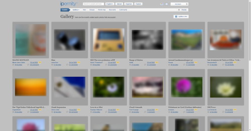
Here we can discuss ideas on how we can optimize the landing page Explore and bring the new internal link Explore / Community to life in terms of content and design so that it is attractive and informative for vistitors from outside.

Here in the main article we will record agreed measures and name the volunteers who will take care of their realization.
Here in the main article we will record agreed measures and name the volunteers who will take care of their realization.
The topic of this discussion has been edited by Public Relations 2 years ago.
This discussion has been closed by Public Relations.
Jump to top
RSS feed- Latest comments - Subscribe to the comment feed for this topic
- ipernity © 2007-2026
- Help & Contact
|
Club news
|
About ipernity
|
History |
ipernity Club & Prices |
Guide of good conduct
Donate | Group guidelines | Privacy policy | Terms of use | Statutes | In memoria -
Facebook
X

Bergfex clubEs ist eine Fotomontage aus einem Screenshot von der Webseite www.filmcasino.at/inklusives-kino, kombiniert mit einem unserer freigegebenen Homepage-Motive. Weil es sich beim Copyright-Inhaber des Kino-Fotos um ein Szene-Kino handelt, könnte ich mir vorstellen, dass wir eine kostenlose Lizenz für die Bearbeitung und Veröffentlichung bekommen könnten. Ansonsten wäre es aber auch leicht, so ein Foto selbst aufzunehmen. Weil die Personen nicht erkennbar sind, würden keinerlei Persönlichkeitsrechte verletzt.
It would be better if the four subjects were not visible all at the same time but came and went one by one with some animation. If they are piled up like this, they need some vertical thing to keep them together, and that "thing" can be used to narrow down the text column, making it easier to read. Also it looked as if the top needed something big to catch the eye first, so I enlarged the page title. The colours are slight variations of the iper blue. Footer color is a test.
I believe that the landing page being between the front page and the rest of the pages, it can be slightly more flamboyant than the normal bread-and-butter ones.
Bergfex clubraingirl club has replied