Fast forward
Cubism
The camera is dead, long live the camera!
Over the edge
T
Over the edge
Lunedi
Treasures from the vaults
Communicator X9000
Friday exploration
Charcoal
Pac-Man revisited
The epic battle of the Plastic Ocean
Gateway to home
Sabattier effect aka solarization
Oops!
BeFunky-collage
Fotor test
Fotor GoArt pretty image test
Ribbet Test
FIRST RULE OF FIGHT CLUB
Pareidolia
There's no spoon
Wet paint!
Meltdown
Blue variation
Appropriately dressed descending a staircase
Eraserhead
Chestnut
TSC395 - Vegetables
Seen Alice?
Better?
Yore
edited file
Brake!
Taillights
Rework on color version
Dark plastic
TSC394 - Rework
Plastic vanitas
This and that
Paddock
Control room
Inside the box
TSC393 - Low angle
See also...
Travelling


♫ Travelling by Al Clark on SoundCloud.
Contribution for The Sunday Challenge #397: Travelling
I got inspired by this old archive image, taken by photographer Pietilä in 1930, available at Finnish National Board of Antiquities via Finna online service.
Contribution for The 50 Images-Project: Still Life 35/50
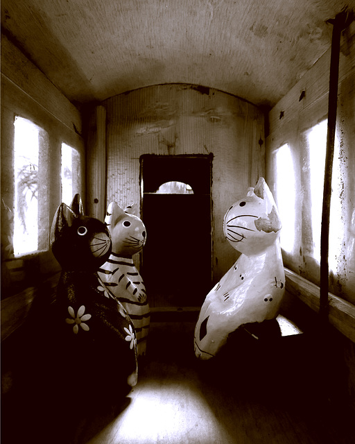
I have had this old toy train for decades, and it often inspires me to photograph it. Those miniature cats are supposedly a rather popular tourist attraction sold somewhere abroad, but to our household they have ended up from the second hand stores.
Contribution for PicMonkey Creative Users
There is not much fancy within this image, at least not at first sight, but When editing this still life, I tried various tricks on PicMonkey. One was to find use for two rather dramatic black and white effects: 'Super B&W' and 'Infrared'. First one works much like a very strong red filter on B&W photography, thus turning red lighter, and cyan brighter. 'Infrared' then seem to do the opposite. Almost the same can be achieved with the 'Black and White' effect, and moving the pointer around the 'Contrast filter'.
I ended up using 'Super B&W' because it nicely turned the roof lighter and the floor very dark. For the comparison, have a look at the original image.
Then I got an idea to try "split toning" on PicMonkey. I first thought it is almost impossible to get the exact tone combinations, which I wanted. But then I realized the same could be done with 'Effects > Curves'. I searched for this to find some tutorials, and indeed found a very good Youtube tutorial by Joe Lenton.
What I then did is that added some red and yellow onto dark areas, and blue onto light areas. There are two different approaches on this. One point of view is to set the shadows to warm brown and highlight to blue. Explanation for this is to bring warm dark ground on landscape pictures closer, and light blue sky further away from the viewer. Another point of view is to define split tones the other way round, because dark shadows are often blueish. So, the light areas then should be brownish. However, I personally like the previous approach more. and it seemed to work better on this case to get the right tone onto wooden surfaces.
christel.k, Heidiho, Gisela Plewe, Nora Caracci and 45 other people have particularly liked this photo
- Keyboard shortcuts:
Jump to top
RSS feed- Latest comments - Subscribe to the comment feeds of this photo
- ipernity © 2007-2024
- Help & Contact
|
Club news
|
About ipernity
|
History |
ipernity Club & Prices |
Guide of good conduct
Donate | Group guidelines | Privacy policy | Terms of use | Statutes | In memoria -
Facebook
Twitter

The Traveling Wilburys - End Of The Line
But thank you anyway =)
Sign-in to write a comment.