Group: Promoting ipernity
8.1 Landing page 'Explore' - Relaunch 2020
|
|
Here we can discuss ideas on how we can optimize the landing page Explore and bring the new internal link Explore / Community to life in terms of content and design so that it is attractive and informative for vistitors from outside.

Here in the main article we will record agreed measures and name the volunteers who will take care of their realization.
Here in the main article we will record agreed measures and name the volunteers who will take care of their realization.
The topic of this discussion has been edited by Public Relations 11 months ago.
This discussion has been closed by Public Relations.
Jump to top
RSS feed- Latest comments - Subscribe to the comment feed for this topic
- ipernity © 2007-2024
- Help & Contact
|
Club news
|
About ipernity
|
History |
ipernity Club & Prices |
Guide of good conduct
Donate | Group guidelines | Privacy policy | Terms of use | Statutes | In memoria -
Facebook
Twitter
raingirl club* Have on the 'Community' page an offical ipernity group. That group could be one that limits uploads to one per day. It would need a member to moderate and run it. (Possibly me, though I need to reduce my groups before adding another one to admin.)
* If possible, include a blog page for members to chat on. I find 'discussion' in a group difficult to follow, so an alternate way of doing that type thing for the general membership is what I'm thinking of. Or if not that then maybe just a link to the pages where communication/discussions about the site in general can happen.
Sami Serola (inactiv… club has replied to raingirl clubSo, the idea to share articles for example under certain keywords could be considered.
BUT, I just also discovered "how-to" explore groups based on "recent discussions":
www.ipernity.com/search/group?opt=1&q=i&w=0&s=2&m=1
Unfortunately one has to write something onto the search field. But if only there would be a way to show something like that with a click of a button, or even on one's own news feed, then that could help... And it could even bring some content onto Explore page. A new sections there to show what is going on.
Some cons though. Especially as anew phenomena, the group administrators have decided to start hiding the group discussions. So, a non group member gets nothing when trying to open the link for some of the groups.
Moreover, unfortunately there is no option to run search among "all groups where one is a member". Instead one get somewhat not so obvious further action to select from the the drop down menu, and then search only on one of those groups.
Bergfex club has replied to raingirl clubwww.ipernity.com/about/us
www.ipernity.com/about/thanks
www.ipernity.com/doc/team/48181694
www.ipernity.com/user/team
www.ipernity.com/blog/team
I imagine that this won't be a text-page with a lot of text, but a graphically well designed overview, which links to the respective content or lets you pop it up as a window.
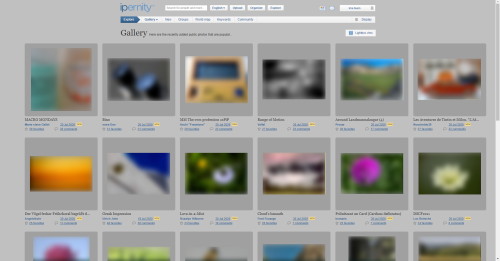
There are some "issues" discussed concerning ipernity Explore. And not only the "Gallery" part of it, but all that one may see when arriving to ipernity web site for the very first time.
Imagine this. You find a nice new web site thanks to somewhat appealing front page. Then you step into a "hallway" and see:
1) Yet another slide show at first, with no direct explanation.
2) The same word "Explore" repeated and seen as links here and there.
3) Search field repeatedly. Although, the other one says "Search for photos".
4) If you click an image on slide show, you end up onto someone's personal page.
5) Only as small you find link for "Among the photos recently added that are popular...", which leads to same place as the new concept "Gallery" presented on the header toolbar.
6) If, and only if, you scroll down, you get to see some groups which you might like for no reason explained (which very likely are some abandoned groups after all).
From advertising point of view, this may not look very appealing after somewhat representable front page. And definitely it does not tell anything about the cool features like possibility to share images on groups, run discussion forums on groups, write blog articles, or upload and share also something else than photos. Neither it tells anything about reasons to join ipernity.
Intention of this post is not to ask immediate actions to change anything. Instead I hope it makes us really think what and how we wish the newbies to see this "our house" when they step into the "hallway" (Explore).
Canvas (discussion) is open for your imagination to run wild. What would you like to find when you step into some new place?
however, it would be more like a "taylored example", with selected contacts, albums, groups and articles, which all presents what can be done, like also sort of a combined "how-to".
So, on photos there could be for example image showing how to use PiPs etc.
And on groups only selected groups that one can find as nice, useful and popular.
Articles that share ipernity related videos etc.
And layout made to present all nice features one can have on a personal home page.
One con though... It would be somewhat limited to one language only, when it comes to section titles.
raingirl club1) Similar type groups gathered together. The page would have general topics labeled then one can peruse which group associated with that topic one wants to check out.
A diagram of sorts for groups. I saw an example somewhere, but can't find it now. Visualize 3 blocks across the page, as many down as needed for however many topics we picked. The blocks contain a background photo with the Topic word over it. It would be a clickable block, taking you to another page where groups about that Topic are listed.
2) A New Members showcase. Something like 'Find new to ipernity photo friends here!', and it would link to a page with a list of the newest members. Would not have to have photos by the new people, in fact I don't think it should. But perhaps it could list the member user name and their place of residence - it would be a link to their news page.
raingirl clubraingirl clubBergfex club has replied to raingirl clubraingirl clubBergfex clubRather we should consider ourselves under marketing points of request, what we want to offer there. What do we aim at with the sides?
Explore: New visitors should be inspired to create at least one trial account. They should be shown a selection of the most attractive functions. They should be guided through ipernity in such a way that they are enthusiastic about it afterwards. They must be told why ipernity is so special. The advantages must be made palatable to them. Explore is not for existing members.
Community: All information about our community and its various committees should be given here. What kind of club are we? What makes us special? What are the organs (board of directors, consultants). What is the history of ipernity? What plans for the future? What is our orientation? How does our association life work.
raingirl club has replied to Bergfex clubThat is the question I want to know from the people helping here on AG, which features on the Explore page are indeed used by members. Then, we can be sure to still have those features available - but still update the page so it is geared towards visitors.
I'm sorry if this is hard to understand, it feels like what I'm trying to say is not in conflict with what you are saying, but just adding a nuance.
raingirl clubPublic Relations clubOnly the content of the site is to be redesigned. Here 99% of the information that would be helpful for a visitor is missing. It is high time to change this.
Jaap van 't Veen club has replied to Public Relations clubPublic Relations club has replied to Jaap van 't Veen clubGreen = it's ok the way it is and it keeps the way it is.
Public Relations clubBergfex club1) Das Bedürfnis nach Verbundenheit
2) Das Bedürnis nach Autonomie
Das erste entsteht schon bein Fötus im Mutterleib durch die Verbindung zur Mutter. Das zweite ebenfalls, nur etwas später. Es führt zum Drang des Ungeborenen, sich von der Mutter zu lösen.
Weil beide Gefühle so tief im Gehirn verwurzelt sind, bekommt man sie niemals los. Werden sie nicht befriedigt, stirbt ein Mensch ziemlich bald. Für das Marketing bedeuten sie: Wenn man mit einem Angebot diese beiden Instinkte antriggert, hat man schon viel erreicht.
Womit erreichen wir diese Instinkte?
1) Die großen Plattformen sind völlig anonym. Man kommt sich verloren vor. Bei ipernity hingegen besteht eine wirkliche Gemeinschaft. Während man bei Facebook nur mit seinen echten Freunden in Kontakt ist, gelingt hier mit Gleichgesinnten, die dasselbe Hobby haben, etwas ähnliches. Jemand aus der Gemeinschaft sagte kürzlich: "Es fühlt sich bei ipernity an wie zu Hause."
2) Das Bedürfnis nach Autonomie führt zum Wunsch nach Selbstverwirklichung. Fotografie ist ein Ausdruck davon. In einer Gemeinschaft wie ipernity kann man dies pflegen und teilen. Aber noch mehr: Man kann die Plattform selbst mit gestalten, was bei Flickr und den anderen nicht ansatzweise möglich ist. Dort ist man den Investoren ausgeliefert, die letztlich Cash haben wollen. Bei ipernity haben wir mehr Freiheit.
Dies in wenigen Worten rüber zu bringen, wird die Herausforderung sein. Denn die "Landing Page" ist klein, und es gibt noch andere wichtige Themen.
*) Aus dem Hörbuch "Wie Träume wahr werden - Das Geheimnis der Potentialentfaltung", erschienen 2018
raingirl club1) I would like to suggest that we include a prominent 'Join Us' link on the Landing Page and each of it's sub-pages. We want to make it as easy as possible for them to sign up at any point while exploring.
Public Relations clubPublic Relations clubPublic Relations clubThe symbolism should be:
Symbol 1: Advantages - expressed, for example, by school bags of first graders (presents, gifts, tokens, packages)
Symbol 2: Unique features - expressed, for example, by a winners' staircase (reward, first price, trophy)
Symbol 3: Community - expressed by a group (people, figurines, silhouettes, shoes, legs, feet, hats, hands)
Symbol 4: Instructions - expressed by a teacher (classroom, black board, magnifying glass, spectacles, binoculars)
Other visualisations of the symbolism can also be made. You are invited to let your creativity sparkle. Probably there are much better ideas!
How the most apt visualisation is finally realised graphically also depends on the style of the artist we find.
Instead of graphics, symbolic photos can of course also be used. Keep in mind that the photos should not just be some kind of beautiful decoration, but should visually support the verbal message of the specific item. They also have the task of creating positive emotions.
Because it is much more difficult to find such photos, we first used graphics in the blueprint. But of course there is also an open space for appropriate photo suggestions. Pictures should be in landscape format 3:2. The motifs must be very easy to recognise at first glance in the small possible representation. Like the graphics, they should of course be in a certain uniform style.
Public Relations clubThis could be a separte page on which we can summarise everything that has been scattered in many places so far:
- a list of members (not yet exiasting)
- who belongs to the ima-team?
- who are the advisors?
- minutes of the annual meetings
- annual reports
- the team blog
This list is probably an incomplete collection of items that still needs to be supplemented.
Sami Serola (inactiv… club has replied to Public Relations clubBut that list looks reasonable for the Explore > Community page. My thoughts for "wordings":
OR dump the Explore > COmmunity, and give these on the landing page.
1) Get to know some of us.
www.ipernity.com/group/bonjour
No need to provide any hard to update and complete alphabetical list. That group is formed by those who wish to show their faces, and that alone is an important aspect.
2) Find out who belongs to Ipernity Members Association (IMA) executive board, assistants, advisors and auditors.
www.ipernity.com/user/team
3) Ipernity Members Association is made possible by active members and based on IMA Statues. We arrange Ipernity General Assembly (IGA) at least every second year. IGA meeting minutes and annual reports are publicly available.
www.ipernity.com/tag/team/keyword/110668/post
www.ipernity.com/tag/team/keyword/132408/post
4) Read the latest team news to stay up-to-date and find out what is new.
www.ipernity.com/blog/team
5) Ipernity has been developed by.
www.ipernity.com/about/thanks
6) Find out how ipernity works.
www.ipernity.com/doc/2319670/48196862
Public Relations clubSami Serola (inactiv… club has replied to Public Relations clubBut I wonder if it would be possible to get the images change every time when the page is refreshed.
Bergfex club has replied to Sami Serola (inactiv… clubWith the three large pictures I would be happy to find something thematically suitable at all.
For the photo of the Rolls Royce I have the copyright, because I took it myself. The other two pictures are taken from the internet. For the mock-up it is ok. For the final version we need others.
Can you use your detective skills to find something in the ipernity content? We could then ask the members concerned.
raingirl club has replied to Jaap van 't Veen clubBergfex clubEs ist eine Fotomontage aus einem Screenshot von der Webseite www.filmcasino.at/inklusives-kino, kombiniert mit einem unserer freigegebenen Homepage-Motive. Weil es sich beim Copyright-Inhaber des Kino-Fotos um ein Szene-Kino handelt, könnte ich mir vorstellen, dass wir eine kostenlose Lizenz für die Bearbeitung und Veröffentlichung bekommen könnten. Ansonsten wäre es aber auch leicht, so ein Foto selbst aufzunehmen. Weil die Personen nicht erkennbar sind, würden keinerlei Persönlichkeitsrechte verletzt.
It would be better if the four subjects were not visible all at the same time but came and went one by one with some animation. If they are piled up like this, they need some vertical thing to keep them together, and that "thing" can be used to narrow down the text column, making it easier to read. Also it looked as if the top needed something big to catch the eye first, so I enlarged the page title. The colours are slight variations of the iper blue. Footer color is a test.
I believe that the landing page being between the front page and the rest of the pages, it can be slightly more flamboyant than the normal bread-and-butter ones.
Sami Serola (inactiv… club has replied to SpoWhat comes to vertical scrolling replaced with switching contents (if I understood it correctly), I belong to "old school". I have nothing against scrolling.
But I do understand the switching pages are more up to date. However, it then requires some some alternative option to swap and navigate through them. I hate waiting =D
So, I suppose you after something like this(?)
shop.moomin.com
Notice the arrows on sides. Witch of course should be more visible.
Similar navigation already exists for photo pages at ipernity, but those arrows only appear when mouse moved, and only on computers (not on mobile browsers).
Spo has replied to Sami Serola (inactiv… clubThen there is the question whether the page should swap content automatically at certain intervals or not at all. I think not.
Bergfex club has replied to Sami Serola (inactiv… clubTake a look, for example, at the online presence of the most renowned German weekly newspaper: www.zeit.de/index
This newspaper is the top product of the German media world. Absolute professionals are at work here!
Or alternatively the brand new website of the 'Deutsche Tagesschau' which is the number one in the German TV landscape: www.tagesschau.de
It is already programmed with floating elements against a fixed background.
Both websites are not widescreen!
In comparison, ipernity is by no means out of fashion.
And scrolling / wiping is very modern again.
Sami Serola (inactiv… club has replied to Bergfex clubIf you open the previously mentioned shop.moomin.com on a mobile phone browser, there are no arrows displayed at all. Only by accident one can then find out one can swipe horizontally.
Public Relations club has replied to SpoFor this picture, which could possibly be suitable for a first start:
www.ipernity.com/group/2603430/discuss/195332/comment/61668902#comment61668902 the request is currently running with the request for permission from the photographer.
If you change later, you will always have to answer the question whether a new picture meets the criteria outlined by Prof. Koeber-Riel (see above). It is least of all a question of taste, or whether a picture is 'beautiful'. It is only a question of whether it serves its purpose well. If one has agreed on one, one has to get the copyright each time anew. Because that is a lot of work, you should consider replacing it at most once a year.
Bergfex clubFirst of all, there already seem to be a potentially good codes for this. For example on "Discover Groups" -page, I noticed the images seem to have picked according to some algorithm. Probably the most active first, and maybe varied somehow.
An example for search according to activity at ❖ Ipernity Photo Gallery ❖. Notice the deliberate use of search words. Very likely there are some old masterpieces and popular members on top. But on the other hand, I think they deserve it.
There are also alternative codes to arrange and present collages, used on personal home pages. One is "Featured albums" -block, and another one is similar "Latest created albums" -block. See the home page layout settings for more.
Now comes the actual suggestion
We use some "curated groups" to pick up the collages at least for the first and second section on the landing page. So, it could look like this:
Possible advantages
If and when using curated groups provided by members like * ઇઉ *, there will be quality guaranteed. No copyright violations should occur either.
By selecting the search words for active group contributions, it should be possible to provide good overviews for the collages.
Another example for the most active contributions search on group Strong Colors curated by * ઇઉ *
P.S. Those collages could be also simpler 2x4, as is on "Explore Groups".
P.P.S. Also most recent search can give wonderful results on curated group and well chosen search word, like "macro" at Bokeh as MAIN Subject.
Bergfex club has replied to Sami Serola (inactiv… clubRemember the legendary Marlboro cowboy. He always managed to seduce people to light a cigarette when leaving the cinema. He triggered the basic human desire for autonomy and has burned himself into our minds as a symbol in such a way that in the last few years Marlboro has not even had to mention the product name. Nespresso is also almost there. You see George Clooney and get an appetite for a coffee ...
I haven't read anywhere that this is possible with photo collages. But I acknowledge the desire to have a better platform for presenting the best pictures from the community than is now the case. Because even I couldn't give a prospective customer clear information, which is very bad.
Is it the ‘Ipernity Photo Gallery’? www.ipernity.com/group/frontpage
Is it the ‘Ipernity Hall of Fame’? www.ipernity.com/group/2287436
Is it the ‘Showcase of Excellence’? www.ipernity.com/group/1015593
I would prefer to separate this wish and its fulfilment from this advertising page which we are just developping.
What would you think of something like the lead for the following page with the groups? So far we have left it to all visitors to find their own way to the best pictures. It is high time that we improve this matter.
Bergfex club has addedOriginal: www.ipernity.com/doc/horizon36/25133325
Photographer: Horizon 36
Title: The bird photographer
Pending approval by the photographer
Public Relations clubFor a more accurate assessment., the sketch has been given the blue side stripes that unregistered visitors will see on laptops and desktops with wide screens . (Users of tablets with the 4:3 format (Samsung, iPad) see the ipernity pages without any side margins.)
Public Relations clubThanks!
Spo has replied to Public Relations clubPublic Relations club has replied to SpoSpo has replied to Public Relations clubraingirl club has replied to SpoOr maybe you are talking about something else all together!
Sami Serola (inactiv… club has replied to Spowww.ipernity.com/club
To make images possible to download has to be done from the:
"Authorizations, license ---> Change"
It is on right side of each image. Turn image either to CC or free.
OR, turn selected people as your "Family" members, and change settings here:
www.ipernity.com/pref/original
Public Relations clubThis collage was compiled from images that are freely visible to everyone at ipernity.
It is only used for a limited period of time for sample purposes. If you do not agree that your picture may be used for this purpose, we will of course remove it.
Since a number of 27 images is not sufficient to symbolise the huge size of our community, we are considering whether to express this by randomly exchanging images every second.
This would look something like this: Animated collage
(There are a few small technical flaws in this visualization, but the principle should be recognizable.)
If such a collage is used at all, we would timely invite you to participate with a current picture of you.
ୱ Kiezkickerde ( ͡°… club has replied to Public Relations clubJüngere Personen kommen ebenfalls nicht vor...
Bergfex club has replied to ୱ Kiezkickerde ( ͡°… clubBergfex club has addedAber womöglich erweckt Bild 1.3 diesen Eindruck. Ich suche mal nach einem Ersatz.
ୱ Kiezkickerde ( ͡°… club has replied to Bergfex clubDann zum Beispiel diese hier:
www.ipernity.com/doc/91258/45244268
www.ipernity.com/doc/elvertbarnes/8988643
www.ipernity.com/doc/xtof/22250291
Noch unter falscher Lizenz, könnte ich mir aber auch gut vorstellen:
Von Typo93:
www.ipernity.com/doc/1107157/44147452
www.ipernity.com/doc/1107157/44147450
Jean-luc Drouin - www.ipernity.com/doc/1922040 - hat auch viele Portraitfotos, die ich mir gut vorstellen könnte und die ein wenig mehr Farbe in das "Weiße Männer und weiße Frauen"- Einerlei bringen könnten.
ୱ Kiezkickerde ( ͡°… club has replied to Bergfex clubBergfex club has replied to ୱ Kiezkickerde ( ͡°… clubDie vorgeschlagenen Bilder habe ich mir angesehen. Zwei können wir direkt übernehmen. Mit Kinderbildern sollten wir aufpassen. Damit handeln wir uns möglicherweise Scherereien ein. Außerdem können unter 16-Jährige gemäß Satzung nicht Mitglied sein. Aus demselben Grunde passen auch die Portraits von Jean-Luc nicht. Sie zeigen zwar Menschen, aber nicht reale ipernity-Mitglieder.
Im Hinblick auf Lizenz können wir uns auf Punkt 5.10 der Nutzungsbedingungen beziehen, welche die Verwendung öffentlicher Inhalte von Usern "im Sinne der Förderung des Dienstes" erlaubt.
Dennoch würde ich mir natürlich wünschen, dass wir mittelfristig nicht auf den Content zurückgreifen, sondern um aktuelle Bilder bitten. Aber die Start-Collage sollte auf jeden Fall schon mal gewisse Mindestansprüche erfüllen. ich baue Deine Vorschläge nachher ein.
1) Gallery, OK(?)
2) New, OK(?) Only Club members get to see, and discovered as useful.
3) Groups, has been discussed by Raingirl, Guido and me. We need to find out what algorithm the old one is based on. How groups get picked there and in what order? On what algorithm the pictures get picked there? Do we keep that old layout, or come up with something entirely new?
4) World Map, NOT OKAY! Super slow, and only very few images out of all GPS located images by thousands of members become picked there. What images become presented there is a total mystery. Currently non-club.members see notice: "Access to this feature requires a club membership." However, it would be better to hide it entirely, just like the "New" section.
5) Keywords, good enough(?)
6) Community, may need some better solution(?) Opening ima,team news breaks the "rule". User does not stay under "Explore", but becomes kicked out to another part of ipernity. Maybe some "landing page" would be needed there as well, which then provides links to ima.team news, face gallery, FAQ, etc. (?)
Bergfex club2) New ✅ For my sake it can also be activated for guests. By the way, we have not yet published the update in the newsflash. I have noted it down.
3a) Groups / design ✅ For the time beeing I woul keep the design. It is reasonably attractive and runs faultlessly. We should keep it that way for the time being. Because we have more urgent building sites.
3b) Groups / content ❗ This should be adjusted so that only living groups are displayed. (For a transitional period I could imagine as a quick solution that we select a corresponding database extract manually at short notice and store the selection. Only Rob can say what is best feasible.)
4) World Map ❗ Very large amounts of data seem to be gathered and transferred. I stop for 12 seconds until the red dots appear. My pictures from my residence are not shown at all, although they all have GPS coordinates. I consider this feature dispensable. I would agree to disable it temporarily until we have a better solution one day.
5) Keywords An ancient and confusing design. I would prefer to see real rankings. But in my opinion it is without any priority. Does anybody even use something like that?
6) Community ❗❗❗❗ This is an absolute priority! Because the information about it is scattered in many places. See: www.ipernity.com/group/2603430/discuss/195332/comment/61631000#comment61631000 It is very bad to expect the users to search for it themselves. For a start it would be enough to realize a quick solution: Let's create a subpage where this content is listed and further linked.
Public Relations clubSee also his earlier contribution to this discussion above.
This proposal is equally supported by the ima team.
We ask for your comments on both existing drafts.
Further drafts are welcome.
Jaap van 't Veen club has replied to Public Relations clubIk zou alleen - bij een introductie-pagina voor ipernity - beginnen met "Who we are"
Helaas kan ik de teksten niet of nauwelijks lezen, dus voorlopig daarop geen reactie
Sami Serola (inactiv… club has replied to Jaap van 't Veen clubSami Serola (inactiv… club has replied to Public Relations clubI only have few remarks, but it would be easier, if those bullet lines could be available somewhere as text.
And what comes to "Read me" -links, I already try to figure out where they could lead, and what could they offer. However, I also suggest that we can leave some of them out at the moment, and figure out later, where they could lead.
What comes to link "The mos beautiful pictures by our members", and what was previously asked
"Is it the ‘Ipernity Photo Gallery’? www.ipernity.com/group/frontpage
Is it the ‘Ipernity Hall of Fame’? www.ipernity.com/group/2287436
Is it the ‘Showcase of Excellence’? www.ipernity.com/group/1015593"
I say it could be similar as the current Explore > New when it comes to layout. I only wonder if that can be done with group search results. From those three options I would choose 'Ipenity Hall of Fame, and shows search results for "mos active":
www.ipernity.com/search/group?opt=1&q=a&w=2287436&s=1&m=0
Reasons: For some reason one can not run such search at 'Showcase of Excellence', and at 'Ipernity Photo Gallery' the quality does not seem to be so good.
raingirl clubIt's a bit hard from this image to get into any detailed considerations (like what is said next to the headings), but in terms of the layout it seems clean and easy to quickly understand what's going on here, and that would get the point across.
To me, this last one is better in terms of quick glances - getting the info across. I like the readability of the headings.
I still like the layout of the prior one better, but that is probably just my artistic eye speaking not a marketing eye. I'm trying to think if there is a middle ground. [It may be that this lastes is the middle ground, I'm just still pondering the idea.]
I can't be sure, but is that a "Join Us" link at the bottom right? If so, that's great!
What would it be like to make that link more in line with the rest of the layout - maybe having it centered at the bottom but a wider/bigger box? I'm thinking about this because while this page is about giving information, the hope is that they will like it and join. Let's make it really really easy for them to notice that 'join us' link.
Maybe the 'Join us' link could stay at the bottom, but we could add a 'Join us' link at the top on thefar right side of the large "Explore!" header. I'm thinking that since one scrolls down to see everything, it would be good to have that at the top as well as at the bottom.
Spo has replied to raingirl clubPublic Relations club3 younger persons,, 2 people of colour.
All real members of our community!
Inspired by 'Kiezkickerde' (see comment above).
Bergfex club has replied to Sami Serola (inactiv… clubChanges can be made at any time afterwards.
Team club(The collage is still being exchanged.)
"Our website is hosted at the technology leader Amazon Web Service"
This is probably too technical. We might rather show the benefits.
Like:
Our website is fast, reliable and secure. (Based on the leader in industry: Amazon Web Service)
Public Relations club has replied to Realbeck clubOur website is fast, reliable and secure, hosted by the industry leader: Amazon Web Service.
Public Relations clubWir heben uns dadurch von gewissen Social Media ab, welche die Freiheit der Kunst in Teilbereichen massiv einschränken.
Team clubWeil wir mit dem Ergebnis noch nicht zufrieden sind, bitten wir die Mathematiker unserer Gemeinschaft um Unterstützung.
In dieser Untersuchung (Abschnitt 4) weist Bergfex auf ein interessantes neues Tool zur Bildbewertung mittels künstlicher Intelligenz hin. Wer Freude am Experimentieren hat, kann es sich ja mal anschauen.
Team clubJanuary 28, 2021:
We thank you for the suggestions you made with respect to new 'Explore' page.
As it has otherwise met with broad approval, we are now starting to roll it out in all languages.
Public Relations clubThere is a follow-up discussion for a refresh of the site in 2023.
Follow this link, please: Landing page 'Explore' - Refresh 2023