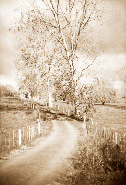
Between Fences
Beam Me Up Scotty
The Great Escape
Somewhere Out There
Ghost Busters
The Green Dream2
The Green Dream
ET Phone Home
LightHouse View
ThePassage
On Flanders Fields
Are You My Mother?
Marble Carver Curtains
Farm Shed Out West
The Fountain Of Youth
Green
Happiness is...
Passing Little Barrier
Sabre Tooth Remembered
The Weekend
The Zephyr R
The Zephyr Grill
The Zephyr
Silver Dollar On The Boundary
The Line
Normandy Remembered
Memories Of Vienna Woods
Across Boundaries
The Marker At Ngunguru Rivermouth
Poplars At Midday
Triumph
A Gotham Afternoon Ride
The Girl With The Pearl Ear Ring
West Ward Ho
Santa Fe (not)
Buffalo
A Night Out With The Gotham City Police
The Faithful Bike
On The Trail Of The Buffalo
Buffalo Hunters
Sugar At The Cross Roads
At The Cross Roads
Outside Gallery259
Raining Cats & Dogs
Fly Pan Am
See also...
See more...Keywords
Authorizations, license
-
Visible by: Everyone -
All rights reserved
-
535 visits
High Noon


© Graham Hughes 2014
All Rights Reserved
FP4+ 35mm. Canon AE-1 Camera. Canon f 1:8 50mm Lense. Developed in LC29. 12mins. Scanned & digitally kissed in Nik SFX Pro2
Translate into English
All Rights Reserved
FP4+ 35mm. Canon AE-1 Camera. Canon f 1:8 50mm Lense. Developed in LC29. 12mins. Scanned & digitally kissed in Nik SFX Pro2
, , and 2 other people have particularly liked this photo
- Keyboard shortcuts:
Jump to top
RSS feed- Latest comments - Subscribe to the comment feeds of this photo
- ipernity © 2007-2024
- Help & Contact
|
Club news
|
About ipernity
|
History |
ipernity Club & Prices |
Guide of good conduct
Donate | Group guidelines | Privacy policy | Terms of use | Statutes | In memoria -
Facebook
Twitter

Graham Hughes club has replied to Sami Serola (inactiv… clubSami Serola (inactiv… club has replied to Graham Hughes clubGraham Hughes club has replied to Sami Serola (inactiv… clubSami Serola (inactiv… club has replied to Graham Hughes clubEDIT: I found my own old article, which I republished at wordpress.com since Opera Community became closed. Here: serola.wordpress.com/2012/10/19/split-toning-using-gradient-map-on-gimp
Graham Hughes club has replied to Sami Serola (inactiv… clubSign-in to write a comment.