Landing Page Picture #3 (animation example)
Landing Page Picture #3 (example)
FireShot Pro Screen Capture #108 - 'ipernity Expl…
Landing Page Picture #1 (example)
Landing Page (sketch 4)
Landing Page Frame
Landing Page Picture #2 (example)
Landing Page (sketch 5)
Landing Page #2 Web Quality
Landing Page #4 Web Quality
Landing Page #1 Web Quality
Landing Page #3 Web Quality
We Are Being Noticed Again!
Landing Page #3 Web Quality (update)
YouTube Ipernity Channel Analytics from 2020-11-20
IP YouTube Dashboard from 2020-11-20
YouTube Intro 3
Merveilleuse Nature
Explore old / test
FireShot Pro Screen Capture #168 - 'ipernity Uplo…
Facebook Advertising (draft)
Daumen hoch
Performance of 'Ipernity Summer Pictures 2021'
Landing Page (sketch 3)
Landing Page (sketch 2)
Landing Page (sketch 1)
IP Channel Status 2020-10-31
YouTube Hits 'ipernity' 2020-10-30
Closing Picture 16:9 For YouTube Videos (4)
Intro Template 16:9 For YouTube Videos (English)
Intro Template 16:9 für YouTube Videos (deutsch)
Intro Template 16:9 For YouTube Videos (2)
Closing Picture 16:9 For YouTube Videos (1)
Closing Picture 16:9 For YouTube Videos (3)
Landing Page (2)
New Landing Page
ipernity-de "Zeig uns Deine Bilder"
ipernity-it "Mostraci le tue foto"
Red Bar
We need your support to make ipernity better known
Using the 'actions' menu for posting at facebook
Screen Capture: 'Ipernity @ www heise de'
Blue line
2018-05 Picture for Press Release [EN]
2018-05 Bild für Pressemitteilung [DE]
See also...
Authorizations, license
-
Visible by: Everyone -
All rights reserved
-
139 visits
- Keyboard shortcuts:
Jump to top
RSS feed- Latest comments - Subscribe to the comment feeds of this photo
- ipernity © 2007-2024
- Help & Contact
|
Club news
|
About ipernity
|
History |
ipernity Club & Prices |
Guide of good conduct
Donate | Group guidelines | Privacy policy | Terms of use | Statutes | In memoria -
Facebook
Twitter


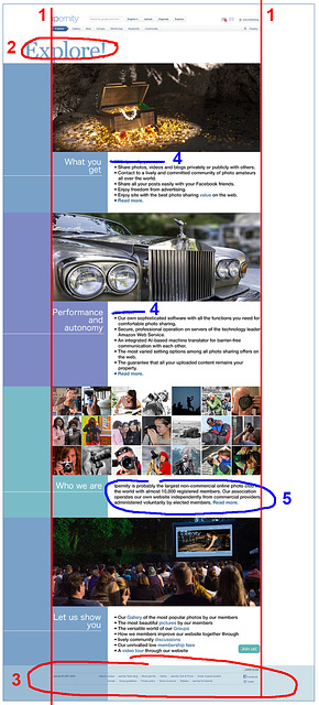
I would also not add any further small headings (4) to the individual chapters. The details under picture 3 should not appear as continuous text (5). It is important that every single argument has a separate line.
In addition, the line breaks are unfavourable, which now occur. The legibility suffers. That would be a rather high price to pay for the admittedly pleasing design.
It is closer to the specs but not quite. I'll try another one.
It is pretty clear now, but boring and office-like, not at all happy. It could be for a medicine company. It could use some vignet graphics just like Raingirl suggested.
Small chapter headings are the question of wording. In the list below the items need to be answers to the same question, and that question may not fit in the main heading in the bar at the left. The main heading needs to be short and sweet and right to the point.
For further development, I think it would be important that you don't leave the edges white, but use the blue default colour, which is given for the visitors:
(btw: The layout is centred on the screen. Obviously Fireshot does not really take the pixels out of the graphics card, but fetches the image information in a different way, whereby inaccuracies occur.)
Not quite so medicine-like anymore, but as a downside the coloured bars need to be images now, slowing down the page. Harings cannot be used, of course, this is just a mock-up.
What I haven't told you yet, by the way, and what I really like is that if you only read the words in capital letters, the message is very, very clear.
What you get: Performance and autonomy.
This in connection with the Rolls Royce shown here is indeed highly appreciated. But this is the way advertising works.
And then something else: The choice of words for the individual sentences still needs to be worked on. This is also a kind of design process. In addition, we still have to think about which points we want to put into the overview and what will be included in the detailed description.
Under no circumstances should we put more than 5 arguments in the overview. Otherwise we will strain the visitors too much.
It is much livelier and less official-looking now, and the message is slightly clearer with the rectanges "pointing" towards the start of chapter texts.
Rectangles can be rotated with css transform property.
Sign-in to write a comment.