
xenophora's photos
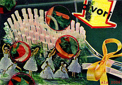
ATC "Green Brush"
| |
|
Collage on board, with some colored pencil added. Originally posted 11/4/06.
I hated this card at first, and almost threw it away. Now it's one of my personal favorites, but I don't know why.

ATC "Q Perm" (ex)
| |
|
The city view (early 1960s San Francisco) is filtered through the "Artistic: Fresco" option. The box and head were filtered through "Blur: Smart Blur." The floating orbs (actually from a page of tartlets, also early 1960s) were picked at with several Art History Brushes and a few other tools as well.
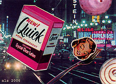
ATC "Q Perm"
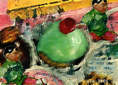
ATC "Bonbon 3" (ex)
| |
|
|
Same card, run through a trio of "Artistic: Watercolor" filters. Other minor adjustments, too. To me, this filter option suggests acrylic paints more than watercolors, but your mileage may vary...
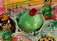
ATC "Bonbon 3"
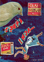
ATC "Canary" (ex)
| |
|
Same card, using the "Sketch: Chalk & Charcoal" filter in shades of dull blue and brick red. The hair was re-penciled for a little more contrast. Other minor adjustments.
By the way: Cards which appear to have foreign lettering really have plain old English text cut up and then re-assembled.
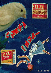
ATC "Canary"
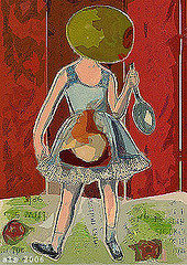
ATC "Olivehead 2" (ex)
| |
|
Here's the "Artistic: Cut Paper" filter again, augmented with the Paint Bucket and a few other tools. Check out the mask effect this created on the upper left side of the "wall." Sort of seasonal, as are the marzipan candies in the kid's midsection.
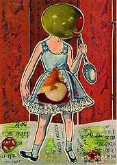
ATC "Olivehead 2"
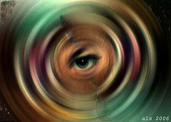
ATC "Cake Eye 2" (ex)
| |
|
The "Blur: Radial Blur" filter is the last refuge for scoundrels and also for badly-considered layouts. It adds intensity and knocks out sloppy pasting with minimal effort. Plus no waxy yellow buildup.
Other tools used were the eyelash brush (yes, it really does resemble a single eyelash on the Photoshop menu) and Clone Stamp, again.
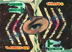
ATC "Cake Eye 2"
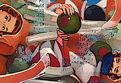
ATC "Salad Ball" (ex)
| |
|
Here, the limbs and faces were gone over with a few miscellaneous tools to smooth (heighten?) their Caucazoid coloring first. A "Blur = Smart" filter smoothed everything out further. Then the whole thing went through the "Artistic = Poster Edges" filter.
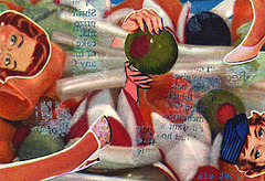
ATC "Salad Ball"
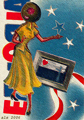
ATC "Olivehead 3" (ex)
| |
|
Same card, run through the "Artistic: Smudge Stick" filter. Originally posted 10/28/06.
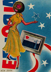
ATC "Olivehead 3"
| |
|
Collage on board. Originally posted 10/28/06.
This made it onto the promotional postcard for a local ATC show a few summers back. If I find the promo, I'll put it up.
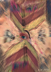
ATC "Cake Eye" (ex)
| |
|
Same picture, after the "Rotate Image" option, the "Blur: Radial" filter and a going-over with one of those brushes that looks like a single eyelash. The eye was re-oriented with the Clone Stamp and a little help from the Blur and Smudge tools:
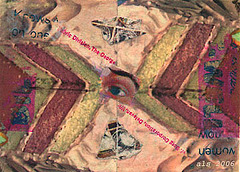
ATC "Cake Eye"
ATC "Yellow Wife" (ex)
| |
|
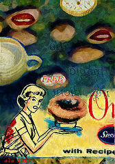
A mix of effects used here. There's some "Artistic: Smudge Stick" filter in the yellow field and over the big eye. Some other tools, too. There's an "Artistic: Sponge" filter over most of the green field. This is one of my first attempts to convincingly alter an actual drawing with computer pencil. Those "paint" smudges over Mrs. Suburbia and her cooking project came with the original picture (from a Pet milk recipe pamphlet), if you were wondering. Originally posted 10/26/06.
