cvd - UK's vaccine orders
par - fido again
par - something this way comes
1822 - Inspection [1 of 25]
TRv6 - final dry fit
par - another face
TiG (land) - steam waggon
TRv6 - nearly there
TRv6 - tucked into the corner
TRv6 - parts laid out
TRv6 - loaded up !
66045 - arrival at Stanegate Restorations
O&S (meme) - Unions vs the three ghosts
clch (meme) thoughts by Crazy Horse
O&S (meme) - mouse stirring
cvd - Welsh guidance [ref Omicron]
O&S (meme) - syndrome ...
cvd - a thought for you
O&S (meme) - new [?] definitions
par - scream !!!
cvd - new cases in Scotland, 15th Dec 2021
cvd - test positivity [dec 2021]
par - woodgrain and model
O&S(meme) - art of the moon
par / css (meme) well spotted
cvd - UK data summary : 28th Dec 2021
cvd - UK data summary : 27th Dec 2021
cvd - UK data summary : 24th Dec 2021
cvd - UK regional "R", 24th Dec 2021
cvd - UK data summary : 23rd Dec 2021
cvd - boosters top10 per 1mpop, 23rd Dec 2021
cvd - vaccine full doses per100 countries rate, 23…
clch - UK Gas prices, Dec 2021
cvd - world regional charts - Africa [6 of 6] ; 23…
cvd - world regional charts - Oceania [5 of 6] ; 2…
cvd - world regional charts - Middle East [4 of 6]…
cvd - world regional charts - Latin America & Cari…
cvd - world regional charts - Europe [2 of 6] ; 23…
cvd - world regional charts - Asia [1 of 6] ; 23rd…
cvd - USA, cases + deaths, 23rd Dec 2021
cvd - worldwide covid-19 infection waves
cvd - World data summary : 23rd Dec 2021
cvd - USA covid deaths, by age & vax status [Oct 2…
cvd - UK data summary : 22nd Dec 2021
cvd - USA ; deaths by vax incidence rate [2021]
See also...
Keywords
Authorizations, license
-
Visible by: Everyone -
All rights reserved
-
20 visits
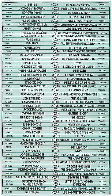
O&S - book titles


This really makes my brain hurt.
Not only is the kerning [spacing] very variable, the letters themselves are inconsistently formatted.
Apart from that, what should be equal height book spines are anything but identical - which shows up as they are placed in a slip case.
.
.
.
Not my Image ; Fair Use & public information
Not only is the kerning [spacing] very variable, the letters themselves are inconsistently formatted.
Apart from that, what should be equal height book spines are anything but identical - which shows up as they are placed in a slip case.
.
.
.
Not my Image ; Fair Use & public information
- Keyboard shortcuts:
Jump to top
RSS feed- Latest comments - Subscribe to the comment feeds of this photo
- ipernity © 2007-2024
- Help & Contact
|
Club news
|
About ipernity
|
History |
ipernity Club & Prices |
Guide of good conduct
Donate | Group guidelines | Privacy policy | Terms of use | Statutes | In memoria -
Facebook
Twitter

Sign-in to write a comment.