
Team's photos


26 Jun 2020
6 favorites
Options Panel
1 = personal background color of your page (default: white)
2 = personal color of the comment fields (default: white)
3a = personal colour for the margins of your screen (standard: medium grey)
3b = screen margins on/off for normal display
4a = order of additional information under photo
4b = the additional information can be hidden
5 = wide screen mode on/off
6 = user help information
7 = number of picture rows (low for slow internet)
8 = pictures a) without frame, b) with frame, c) with filled frame
9 = activation of changed settings
See: Club News 2020-06-26 .

10 Jun 2020
1 favorite
Blueprint "What's hot" - wide screen (update)
Previous version:

09 Jun 2020
2 favorites
10 comments
space

09 Jun 2020
1 comment
'What's hot' - wide screen, optimized
[3] The left-justified arrangement of portrait-format images still is disharmonious.
Solution: (2 alternatives)
[3A] ✅ Centering and framing (as 'Bing' does)
[3B] ✅ Filled frames (as 'Fotoforum' does, but only slightly darkened
background color)
Positive side effect: In both solutions the horizontal alignment is also improved. For marketing reasons we prefer them as default settings for accidental visitors from the web.
____________________________________________________________
The 3 alternatives (unframed - framed - filled frames) have been made selectable via the 'Display settings'. So you can use what you prefer.
The color of the filled frames depends from the background color. It is only grey wtih paperwhite background. With colored backgrounds it will have the same color a little bit darkened. Try it!

09 Jun 2020
9 favorites
1 comment
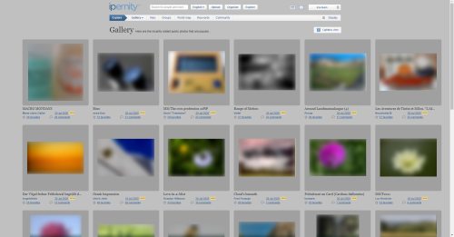
'What's hot' - 3 columns view, optimized
(1) The selection menu on the left causes an asymmetry and narrow horizontal
image distances.
✅ Shifted to the header. The page structure is now symmetrical.
The images are better separated from each other.
(2) The picture details are arranged inharmoniously.
✅ Details better arranged, links adapted to the general web convention.
(3) The left-justified arrangement of portrait-format images seems disharmonious.
⛔️ Centering unfavourable.
It would result in disharmony with the picture details.
(4) Different formats result in an unpleasant horizontal offset of the image
information.
✅ Images aligned at the bottom edge.
(5) 50% of the screen area is unused (right and left margin added)
✅ A slight improvement is caused by the larger image distances.
- - - - - - - - - -
To discuss:
⭕ The number of views is still missing.
⭕ The description of the picture - or a snippet - is missing.
⭕ Portrait format is still unharmoniously arranged

08 Jun 2020
4 favorites
Screenshot 2020-06-08 13.01.13

08 Jun 2020
3 favorites
2 comments
Screenshot 2020-06-08 08.38.39
lefthand: old version
1) Titles have a different line position, which makes a messy impression.
2) The English/American date format is often misunderstood.
3) The complete statistic information can only be viewed by mouse-over, which is cumbersome.
righthand: : updated
1) Titles aligned
2) Generally understandable date format
3) Facilitating the visibility of statistics

21 May 2020
3 favorites
Screenshot 2020-05-24 19.44.43
See: www.ipernity.com/blog/team/4731512

21 May 2020
3 favorites
Screenshot 2020-05-21 13.43.05
See: www.ipernity.com/blog/team/4731512
