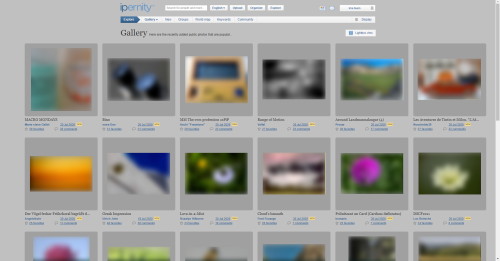
'What's hot' - wide screen, optimized
space
Blueprint "What's hot" - wide screen (update)
Options Panel
Panneau d'Options
Options-Menu
Screenshot 2020-06-26 EN
Screenshot 2020-06-26 FR
Screenshot 2020-06-26 DE
Position Comparison of Statistical Data
Comparison of "What's hot!" versions
2020-07-16 Opinions about Esperanto
Newsflash 2020-07-24 Pic3 [GE]
Newsflash 2020-07-24 Pic3 [FR]
Newsflash 2020-07-24 Pic3 [EN]
Newsflash 2020-07-24 Pic2 [GE]
Newsflash 2020-07-24 Pic2 [FR]
Newsflash 2020-07-24 Pic2 [EN]
Newsflash 2020-07-24 Pic1 [GE]
Newsflash 2020-07-24 Pic1 [FR]
Newsflash 2020-07-24 Pic1 [EN]
Explore/What's hot <-----> Explore/Galerie (normal…
2020-07-31 Opinion on the Introduction of Esperant…
Screenshot 2020-06-08 13.01.13
Screenshot 2020-06-08 08.38.39
Screenshot 2020-05-24 19.44.43
Screenshot 2020-05-21 13.43.05
#0322 (proof)
Annaig_A
Annaig_C
Annaig_B
Annaig_A
#0321 (proof)
#0321 (approved)
3 years of autonomy
#0319 (proof)
#0319 (approved)
#0318 (proof)
#0317 (proof)
#0316 (proof)
#0313 (proof)
#0312 (proof)
#0312 (approved)
Covid-19 Financial Help
#0309 (proof)
See also...
Authorizations, license
-
Visible by: Everyone -
All rights reserved
- Photo replaced on 10 Jun 2020
-
642 visits
'What's hot' - 3 columns view, optimized


(1) The selection menu on the left causes an asymmetry and narrow horizontal
 image distances.
✅ Shifted to the header. The page structure is now symmetrical.
The images are better separated from each other.
(2) The picture details are arranged inharmoniously.
✅ Details better arranged, links adapted to the general web convention.
(3) The left-justified arrangement of portrait-format images seems disharmonious.
⛔️ Centering unfavourable.
It would result in disharmony with the picture details.
(4) Different formats result in an unpleasant horizontal offset of the image
information.
✅ Images aligned at the bottom edge.
(5) 50% of the screen area is unused (right and left margin added)
✅ A slight improvement is caused by the larger image distances.
- - - - - - - - - -
To discuss:
⭕ The number of views is still missing.
⭕ The description of the picture - or a snippet - is missing.
⭕ Portrait format is still unharmoniously arranged
(2) The picture details are arranged inharmoniously.
(3) The left-justified arrangement of portrait-format images seems disharmonious.
(4) Different formats result in an unpleasant horizontal offset of the image
(5) 50% of the screen area is unused (right and left margin added)
- - - - - - - - - -
To discuss:
⭕ The number of views is still missing.
⭕ The description of the picture - or a snippet - is missing.
⭕ Portrait format is still unharmoniously arranged
Au Cœur... diagonalhorizon, Kawasirius, ranking, Public Relations and 5 other people have particularly liked this photo
Comments
Team
club
Please post comments only underneath the article.
3 years ago.
- Keyboard shortcuts:
Jump to top
RSS feed- Latest comments - Subscribe to the comment feeds of this photo
- ipernity © 2007-2024
- Help & Contact
|
Club news
|
About ipernity
|
History |
ipernity Club & Prices |
Guide of good conduct
Donate | Group guidelines | Privacy policy | Terms of use | Statutes | In memoria -
Facebook
Twitter