spoon
feather
Decke an Wendeltreppe
... paper stripes ... pensieri ...
white out store
first snow tower
Macro Mondays
Frost on Glass
trip to glass planet
Sunday Morning on the Bridge
cut
Canterbury Bell
have a look
Bali Starling (mynah)
Here's Looking at You
SSC: high key
Kokmeeuw - Black-headed gull
White elephant (Explored)
Motiv-Vase mit natürlichen Elementen
high key
Weiße Fassade in Hamburg-Eppendorf (3xPiP)
Eis-Zeit
Mérial c'est ça aussî !!
give me some light, please
MM: high key
Schwarzwald
ten in a row plus one
Schneezaun
Der Engel
take up the thread I
longing
red on white
Footprints of a Casual Trespasser
Another Beautiful Autumn Day
Perfect Pompom
black and white
shades of grey and white
Exposure Error
Behind the Curtain
swan lake
hold on
snow lines
space
Schneeteufel
Siehe, der Mensch
1/2000 • f/1.8 • 45.0 mm • ISO 200 •
OLYMPUS IMAGING CORP. E-M1
OLYMPUS M.45mm F1.8
EXIF - See more detailsSee also...
Authorizations, license
-
Visible by: Everyone -
All rights reserved
- Photo replaced on 08 May 2017
-
439 visits
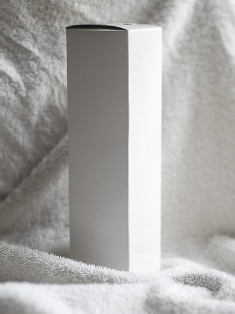
White on White


The Sunday Challenge: White on white photograph.
Except for highlight and shadow this is otherwise unprocessed. This is the colour version.
I replaced the photo with a lighter version and removed the note.
Except for highlight and shadow this is otherwise unprocessed. This is the colour version.
I replaced the photo with a lighter version and removed the note.
aNNa schramm, christel.k, Gudrun, Jean and 4 other people have particularly liked this photo
- Keyboard shortcuts:
Jump to top
RSS feed- Latest comments - Subscribe to the comment feeds of this photo
- ipernity © 2007-2024
- Help & Contact
|
Club news
|
About ipernity
|
History |
ipernity Club & Prices |
Guide of good conduct
Donate | Group guidelines | Privacy policy | Terms of use | Statutes | In memoria -
Facebook
Twitter

There is of course the issue of the light meter getting fooled by the "whiteness", like when shooting a snowy landscape, which is why overexposing is recommended on many photography handbooks. It is also often recommended to make print (presentation) where both can be found, some spots of pure white, and some spots of full black. But that of course depends on the subject.
Puchinpappy club has replied to Sami Serola (inactiv… clubPhLB - Luc Boonen club has replied to Sami Serola (inactiv… clubSami Serola (inactiv… club has replied to Puchinpappy clubAlso the first version has its advantages. For me it works as very melancholic version.
Gudrun club has replied to Puchinpappy clubmir gefällt die Struktur vom Handtuch, mal detailreich, mal weich und unscharf!
Sign-in to write a comment.